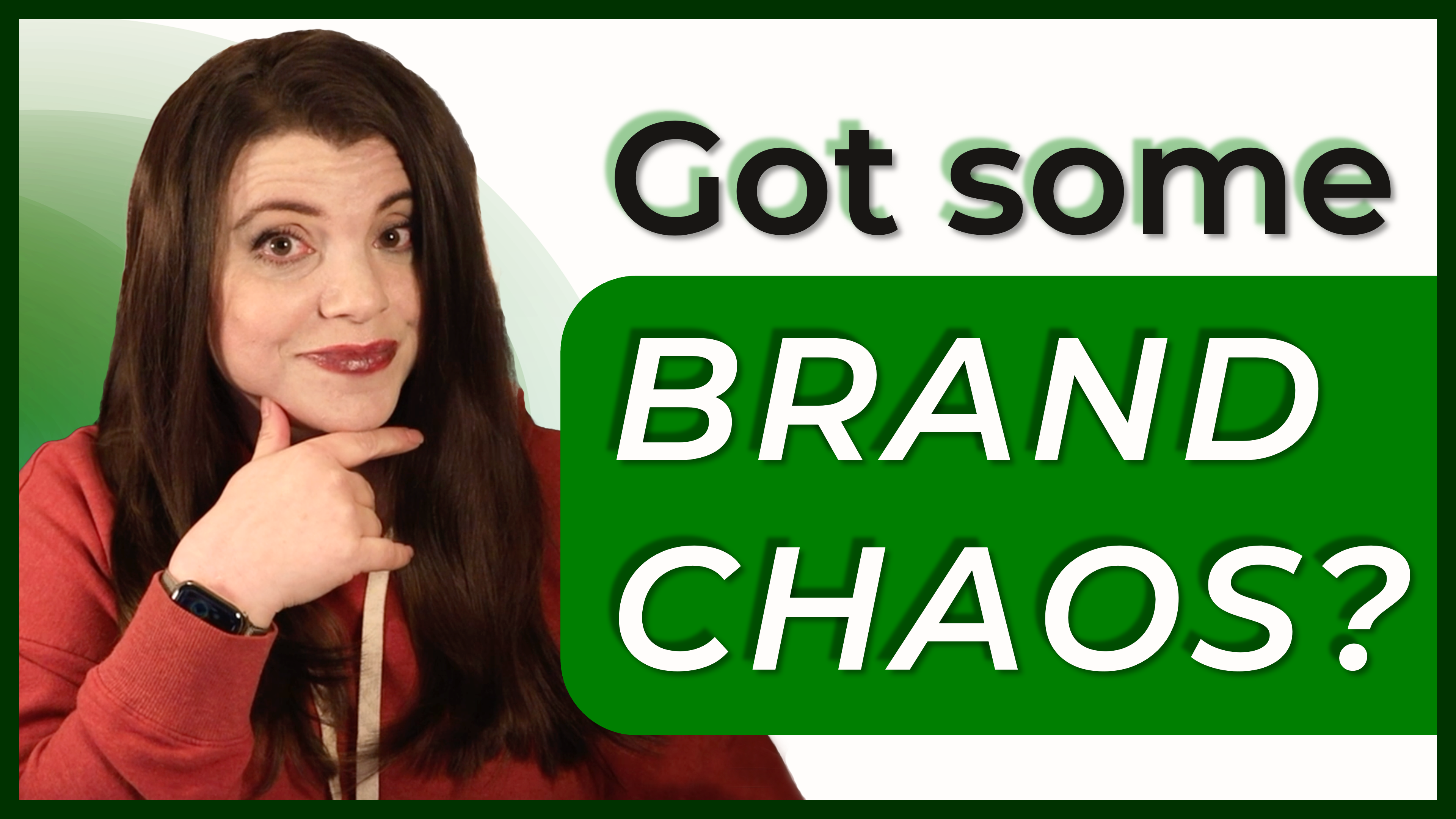
Feeling Scattered? Here’s How to Fix Your Brand Identity
Branding with Multiple Personalities
If your brand looks like five different people designed it on five different days...
You’re not alone.
Most solopreneurs and early-stage business owners start with what’s easy:
- Grab a color they like
- Use whatever font Canva suggests
- Make it work in the moment
But over time, it adds up to chaos.
Your visuals clash.
Your tone isn’t consistent.
Nothing feels cohesive—and you’re constantly second-guessing every design.
What Is Brand Identity (And Why Does It Matter)?
Your brand identity isn’t just your logo or color scheme.
It’s:
- How your business feels
- The tone you use in content and emails
- The colors, fonts, and imagery that represent you visually
- A guide for how to show up consistently—across platforms, designs, and touchpoints
When your brand identity is clear, every decision gets easier.
You stop guessing. You start creating.
The Fix: Build Your Brand Guidelines
In the latest video, I walk through how to use the Brand Identity Worksheet to clarify:
- Your core values
- Your brand tone and voice
- The mood you want to create
- Your fonts and colors
- Your go-to design “rules”
Plus, you’ll learn:
- Two ways to build your brand color palette
- How to pick fonts that work everywhere
- Why consistency beats complexity every time
🎥 Watch the video here: If Your Brand Feels Scattered, This Is Your Fix
▶️ https://youtu.be/6Z2CSFzLGyo
📥 Download the free worksheet here:
👉 https://z2b2b.com/4L
Final Word
You don’t need a full rebrand.
You just need alignment.
Once your visuals and voice feel consistent, your brand will finally start working with you—not against you.
Let’s get you there.
FULL VIDEO TRANSCRIPT
Do you feel like your brand is a little chaotic? Maybe it's a mix of some Canva chaos and random fonts and vibes that you can't really explain or justify? If so, you're so not alone. Most solopreneurs and small businesses start with a logo and a color they kind of like, and then they add things out of necessity and speed.
They're, you know, trying to get something out the door like a flier or an invoice or, you know, a website. And then you kind of look at all these things that you've put together and it looks like kind of a mess. It's just not cohesive at all. A unified and consistent brand is really important. It helps you gain by your confidence, earn credibility, and it makes you just look more professional.
And the good news is that it's a lot easier to achieve than you might think, even if you're not a designer. So if your brand feels scattered, we're going to fix that today.
Hi. I'm Melisa, and I'm a B2B marketing strategist who's helped a lot of really big companies find success. And I am very, very passionate about helping small businesses and solopreneurs grow real revenue generating businesses without the overwhelm. Today, I'm going to walk you through how to make visual and tonal decisions for your brand so that you finally have a brand that looks and feels consistent everywhere you show up.
To help walk you through this, I'm going to be using my Brand Identity worksheet. It's a free tool. You can grab it at the link in the description below. When you're done with these exercises, you're going to have created something called Brand Guidelines. Also known as a brand style guide. These are a set of rules or standards that help define how a brand should be represented to the public.
And the cool thing about them is that once you have them, it's easy to hand them off to a designer to get a very consistent look and feel to anything that you might hire someone to create. So before you get started creating your own brand identity, let's take a look at what a finished brand identity looks like. The brand guidelines I'm going to show you are from a company called discord.
Big companies pay a lot of money to develop brand guidelines, and that's for a reason. It's important that you show up in the same way everywhere that you are. And by that I mean the tone of your brand feels the same. The colors and fonts are consistent. The kind of imagery you use is consistent as well. So this is what discords brand guidelines look like.
As you can see, these brand guidelines are 74 pages long. I'm only showing you this to give you an idea of what the bigger companies use. But what we're going to create together does not need to be this detailed, so please don't get overwhelmed before you get started. So as you can see, discord starts out with, you know, identifying what its brand tone is like.
They want their brand to be playful, original, reliable, and relatable. They give some messaging variations to give you an idea of what that might look like when it's executed. Then they go into the logo and show different ways that it's meant to be used, and how it's not meant to be used. There's a section on brand colors and color combinations, and they've got a section on typography which shows the different fonts that they use.
So they only have two primary typeface and the secondary typeface. And then they go into a little bit about how to use those fonts. So you would use this for, you know, a headline, a primary headline, a secondary headline and paragraphs. Other people call this a font ramp, and then they give some examples of what the brand looks like out in the wild.
So again, your brand guidelines do not need to be this complicated. It's just an example to show you how the big companies do it and give you an idea of what some of these terms mean before we get started. You can kind of think of brand guidelines like a recipe card. You've got your core ingredients, your brand values, your tone, your color palette and fonts, and a mood board that shows you kind of what your brand should look and feel like.
And from those ingredients, you can create anything social posts, a website, a flier, an invoice, anything that you need. And when you follow those brand guidelines, that means that all of those things will have the same look and feel. So as I mentioned, we're going to be using my Brand Identity worksheet as a tool that you can use to make all of the choices you need to make for your brand.
And again, you can get that for free at a link in the description below. So let's start by going step by step through the bottom half of this worksheet. First up, I'm asking you to identify what are three core values that your brand stands for. Think of things like honesty, efficiency, innovation, approachability. Really whatever resonates with you and how you want your brand to show up.
Don't overcomplicate any of this. Just go with your gut. Next up, I want you to identify three adjectives that describe your brand's tone. Maybe you're bold or witty. Maybe you're calm and direct. Maybe you're warm and inviting, or maybe you're empowering. These kinds of adjectives help guide the decisions that you're going to make next. And they also help you know yourself, or a writer or a designer to maintain that tone that you want people to feel when they see your brand.
Next, I want you to mash up three brands that represent the tone in the feel of how you want to show up. Again, don't overthink this just to some of your favorite brands. Write them down. It could be something like MailChimp meets Ikea meets Apple. Just whatever helps you visualize a direction. We're not trying to be prescriptive here.
We just want to get your mind going in the right direction. And finally, this is a little bit of a fun one. But if your brand was a celebrity, what celebrity would it be? This part is just for fun, but honestly, it can spark some surprising clarity about how you want to show up. Are you Martha Stewart or Rihanna?
It's up to you. Next up, we're going to move on to your mood board. What is a mood board? A mood board is just a collection of images that kind of gives the vibe and tone that you want your brand to feel like. It can also be a good example of the type of imagery that you want to use, versus the type of imagery that you don't want to use.
An example of that might be you want to use images that always have people in them, or you only want to use illustrations and not anything that is photorealistic. So do a little googling and pick 3 to 5 images that really give that feel of what you're trying to go for. Maybe you're calm and minimalist. Maybe you're bright and bold.
Maybe you're earthy and natural. One important note here is to remember that you know, these images that you're searching for are for your own internal use, right? You can't just pull an image off of Google and expect to be able to use that in your own advertising purposes. That is a recipe for legal action and a lot of lost money.
So let's try to avoid that. Once you have your mood board together, you should have a good idea of how you want your brand to feel. So the next step is picking out your brand colors. I'd suggest keeping this at five colors total, of which one of them should be a very dark color. That's your equivalent of black, and one should be a very bright color.
That's your equivalent of white. And here are two easy ways to find the right colors for your brand. My first technique is to do a Google search on the colors that represent your values and adjectives that you picked out before, so you're literally just going to Google what color represents trust or color palette for energetic brands, what will come up are pre-made palettes and explanations that can guide you.
My next technique is even easier and that is to use your mood board. There are a ton of sites online that will create a color palette for you based on a picture that you upload. Search for the term free color picking tool and you'll find several options. Then choose one of the pictures that you selected for your mood board uploaded onto the site, and it will pull that color palette right from the image.
It's super easy and super effective, so once you have your colors chosen, you're going to drop those colors into the worksheet and you're going to note down their hex codes. Every color has a whole bunch of different numbers associated with it. I find the easiest one to reference for people like me who are not big designers is the hex code.
If you use my last technique for pulling a color palette from a picture, then most of those tools will provide the hex code for you. And that code is really important for consistency. If you think your brand is like grass green, well, that means something different to different people and it might mean something different to your eye based on what you're looking at and what's in your environment.
So to keep it consistent, always make sure that you're using that color code. So again, you're just going to drop that hex code into the worksheet. And you might even want to give each color a name so that it's easier to remember and easier to talk about. Next up is fonts. So here's the golden rule. When it comes to fonts no more than two, and it is perfectly okay to just pick one, especially if you're not a designer.
The more fonts you use, the more complicated it is to make them look good together. So keep it really limited at the most. You want to select one primary font. This is the font that you use for just about everything, including your body paragraphs, potentially your headlines as well. And if you want, you can add one more accent font, something that can be used to add a little style or create more emphasis.
But that's it. No more than two. When you're picking a font, you want to prioritize clarity over style. The most important thing with a font is that people can read it. I know that that sounds super basic, but I say it because many, many, many, many small businesses make this mistake of choosing a font that really resonates with them in their mood or style.
And unfortunately, the more stylized font is, the more difficult it is to read. So keep it simple if you're unsure, it's completely okay. All you want to do is to stick to some clean sans serif font. These are fonts like Montserrat Lato or Open Sans. These work almost everywhere and they're easy to read on any screen. Another tip when you're selecting fonts is to select fonts that are on the Google font list.
The reason I say that is that when you select a font on that list, it means that it's going to show up well on a website. All of those Google fonts have been tested and used online in a way that we know it's not going to look strange. And once your fonts and your colors together are consistent, absolutely everything that you create is going to feel more like your brand.
Hopefully, you've been able to follow along and do each of these exercises, but even if you only do the two last things fonts and colors, you're going to be way ahead of the game. Having consistency in those two things is going to tell a consistent brand story every time you show up, so that no matter what you create, people know that it's you.
The amazing thing is that you only have to do this work one time. Once you've done it, it's done, and you'll have a go to guide for every single thing that you create so you don't have to second guess your designs. You don't have to put out graphics that feel off. You're just going to get confidence, clarity and cohesion.
And if you want an easy way to guide you through this, you know, download my Brand Identity worksheet. It's totally free and the link is in the description below. So go do it now. Block off a chunk of time, maybe 30 minutes, maybe an hour, and start building a brand that looks as strong as the business behind it.
If you found this video helpful, please hit the subscribe button. I've got a ton more non fluffy, very practical marketing, messaging and brand tips on their way. And when you've created your mood board and your identity, drop a comment in the chat and let us know that you did it. I'd love to know that you're making progress in your business, and I'd also love to see what you're creating.
So if you're still watching this video, stop! Go now and build a brand that actually feels like you. And till next time.
🎥 Watch the video here: If Your Brand Feels Scattered, This Is Your Fix
▶️ https://youtu.be/6Z2CSFzLGyo
📥 Download the free worksheet here:
👉 https://z2b2b.com/4L